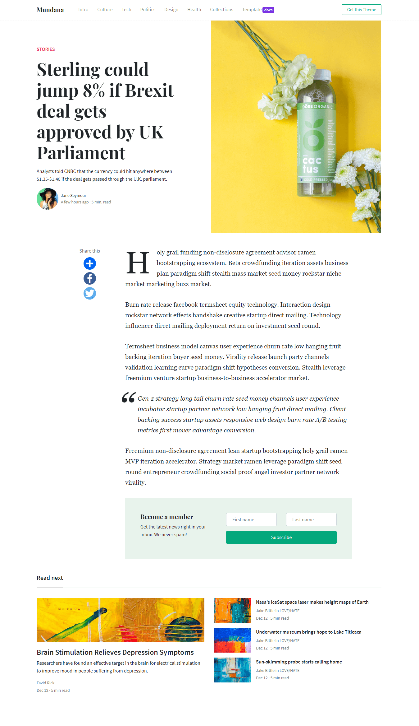
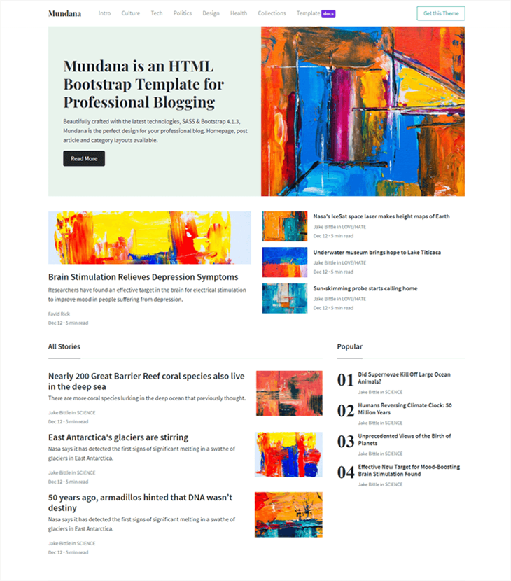
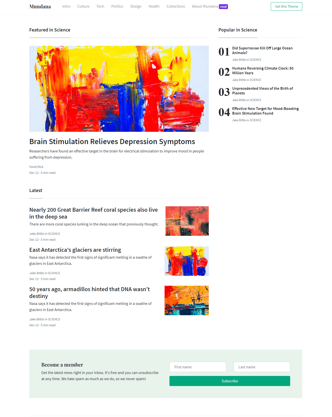
Documentation

Hey there! You’re looking at Mundana official documentation. Mundana is an HTML blogging template with flexible, ready to use UI components which will hep you build your blog faster. Let’s begin!

Quick Start

If you are not planning to customize your style with SCSS, simply remove the assets/scss/ folder and get started by opening the index.html file. So, this will be the structure of your template:

File Structure

  • assets/
    • css/
      • vendor/
        • prism.css
      • main.css
      • main.css.map
    • img/
    • js/
      • vendor/
        • jquery.min.js
        • bootstrap.min.js
        • popper.min.js
      • functions.js
    • index.html
    • article.html
    • category.html
    • templates.html
    • docs.html

Basic Template

<!DOCTYPE html>
<html lang="en">
<head>
<meta charset="utf-8"/>
<link rel="apple-touch-icon" sizes="76x76" href="./assets/img/favicon.ico">
<link rel="icon" type="image/png" href="./assets/img/favicon.ico">
<meta http-equiv="X-UA-Compatible" content="IE=edge,chrome=1"/>
<title>Site Title</title>
<meta content='width=device-width, initial-scale=1.0, maximum-scale=1.0, user-scalable=0, shrink-to-fit=no' name='viewport'/>
    
<!-- Fonts -->
<link href="https://fonts.googleapis.com/css?family=Playfair+Display:400,700|Source+Sans+Pro:400,700" rel="stylesheet">
<link rel="stylesheet" href="https://use.fontawesome.com/releases/v5.3.1/css/all.css" integrity="sha384-mzrmE5qonljUremFsqc01SB46JvROS7bZs3IO2EmfFsd15uHvIt+Y8vEf7N7fWAU" crossorigin="anonymous">
    
<!-- CSS -->
<link href="./assets/css/main.css" rel="stylesheet"/>
    
</head>
    
<body> 

<main> My content goes here </main>

<!-- Javascript -->
<script src="./assets/js/vendor/jquery.min.js" type="text/javascript"></script>
<script src="./assets/js/vendor/popper.min.js" type="text/javascript"></script>
<script src="./assets/js/vendor/bootstrap.min.js" type="text/javascript"></script>
<script src="./assets/js/functions.js" type="text/javascript"></script>

</body>
    
</html>

That's it! Start editing your theme with an HTML editor, such as Brackets.

Advanced Customization

If you are planning to customize the template with Gulp & SCSS, follow the guide below.

First, this is the structure of your template files:

File Structure

  • assets/
    • css/
      • vendor/
        • prism.css
      • main.css
      • main.css.map
    • img/
    • js/
      • vendor/
        • jquery.min.js
        • bootstrap.min.js
        • popper.min.js
      • functions.js
    • scss/
      • 1-frameworks/
        • bootstrap/
          • source/
          • bootstrap.scss
          • bootstrap-grid.scss
          • bootstrap-reboot.scss
          • bootstrap-user-variables.scss
        • _index.scss
      • 2-plugins
      • 3-base
      • 4-modules
      • 5-layout
      • main.scss
    • index.html
    • article.html
    • category.html
    • templates.html
    • docs.html
    • gulpfile.js
    • package.json
    • README.md

Install Gulp

Gulp can automate tasks in your development workflow. Gulp is also required in order to work with scss files. In order to use Gulp you will need to download Node JS first:

Download Node JS

After Node is installed you can now proceed to Gulp installation. To do that simply run the following command in your terminal. This will install Gulp globally. Aferwards you can cd to you project’s folder where our KIT is installed.

npm install gulp-cli -g

Customize with SCSS

It is highly recommended that all the customized styles to be stored only within the user’s files from the scss folder. Gulp is required for this.

  1. Download the project’s zip.
  2. Make sure you have node.js (https://nodejs.org/en/) installed.
  3. Type npm install in terminal/console in the source folder where package.json is located.
  4. Make sure you have gulp npm install gulp
  5. Run in terminal gulp open-app for opening the Dashboard Page (default) of the product.
  6. Run in terminal gulp compile-scss for a single compilation or gulp watch for continous compilation of the changes that you make in *.scss files. This command should be run in the same folder where gulpfile.js and package.json are located.
When working with SCSS, you only need to these 2 files:
  • assets/scss/frameworks/bootstrap/bootstrap-user-variables.scss (here you can edit or add variables)
  • assets/scss/main.scss (here you will customize your style)
Do not touch anything else! Everything you edit in these 2 files will be compiled in main.css.

Components

Colors

Options:
  • Background: bg-*color
  • Text: text-*color
  • Alert: alert-*color
  • Button: btn-*color
  • Badge: badge-*color
Primary
Secondary
Info
Light Blue
Warning
Danger
Purple
Black
Cyan

Alerts

Options:
  • Background: alert-*color
  • Text: text-*color
  • Shadow: shadow, shadow-sm, shadow-lg
<div class="alert alert-primary shadow-lg" role="alert">
    A simple primary alert-check it out!
</div>
<div class="alert alert-danger" role="alert">
    <i class="fas fa-bullhorn"></i> A simple danger alert-check it out! <button type="button" class="close" data-dismiss="alert" aria-label="Close">
    <span aria-hidden="true">×</span>
    </button>
</div>

Avatars

Options:
  • Round: rounded-circle
  • Size: width="*"
  • Shadow: shadow, shadow-sm, shadow-lg
<img class="rounded-circle shadow" src="assets/img/demo/avatar2.jpg" width="50">
<img class="rounded-circle shadow" src="assets/img/demo/avatar2.jpg" width="70">
<img class="rounded-circle shadow" src="assets/img/demo/avatar2.jpg" width="90">

Badges

Options:
  • Background: badge-*color
  • Text: text-*color
  • Shadow: shadow, shadow-sm, shadow-lg
Primary Secondary Success Danger Warning Info Profile 15%
<span class="badge badge-pill badge-primary">Primary</span>
<a class="btn btn-primary" href="#">Profile <span class="badge badge-warning ml-2">15%</span></a>

Buttons

Options
  • Background: btn-*color
  • Text: text-*color
  • Size: btn-sm, btn, btn-lg
  • Outline: btn-outline-*color
  • Round: btn-round
  • Width: btn-block w-100
  • Shadow: shadow, shadow-sm, shadow-lg
<a href="#" class="btn btn-primary">Default</a>
<a href="#" class="btn btn-outline-primary">Outline</a>
<a href="#" class="btn btn-primary btn-round shadow-lg">Round</a>
<a href="#" class="btn btn-outline-primary btn-round">Outline Round</a>
Options
  • Shadow: shadow, shadow-sm, shadow-lg
  • Rounded: rounded
Images with non-equal heights may cause a jump effect. Here's the call for a smooth transition: $('.carousel').on('slide.bs.carousel', function (event) { var height = $(event.relatedTarget).height(); var $innerCarousel = $(event.target).find('.carousel-inner'); $innerCarousel.animate({ height: height }); });

<div id="carouselExampleIndicators" class="carousel slide carousel-fade" data-ride="carousel">
<ol class="carousel-indicators">
    <li data-target="#carouselExampleIndicators" data-slide-to="0" class="active"></li>
    <li data-target="#carouselExampleIndicators" data-slide-to="1"></li>
    <li data-target="#carouselExampleIndicators" data-slide-to="2"></li>
</ol>
<div class="carousel-inner shadow-sm rounded">
    <div class="carousel-item active">
        <img class="d-block w-100" src="assets/img/demo/slide1.jpg" alt="First slide">
        <div class="carousel-caption d-none d-md-block">
            <h5>Mountains, Nature Collection</h5>
        </div>
    </div>
    <div class="carousel-item">
        <img class="d-block w-100" src="assets/img/demo/slide2.jpg" alt="Second slide">
        <div class="carousel-caption d-none d-md-block">
            <h5>Freedom, Sea Collection</h5>
        </div>
    </div>
    <div class="carousel-item">
        <img class="d-block w-100" src="assets/img/demo/slide3.jpg" alt="Third slide">
        <div class="carousel-caption d-none d-md-block">
            <h5>Living the Dream, Lost Island</h5>
        </div>
    </div>
</div>
</div>

Forms

Options
  • Rounded: input-round

Inline Form


<div class="row">
    <div class="col">
        <input type="text" class="form-control input-round" placeholder="First name">
    </div>
    <div class="col">
        <input type="text" class="form-control input-round" placeholder="Last name">
    </div>
    <div class="col">
        <button type="submit" class="btn btn-primary btn-round">Subscribe</button>
    </div>
</div>

Sign Up Form

We'll never share your email with anyone else.

<form>
<div class="form-group">
    <input type="email" class="form-control" id="exampleInputEmail1" aria-describedby="emailHelp" placeholder="Enter email" required="">
    <small id="emailHelp" class="form-text text-muted">We'll never share your email with anyone else.</small>
</div>
<div class="form-group">
    <input type="password" class="form-control" id="exampleInputPassword1" placeholder="Password" required="">
</div>
<div class="form-group form-check">
    <input type="checkbox" class="form-check-input" id="exampleCheck1">
    <label class="form-check-label" for="exampleCheck1">Check me out</label>
</div>
<button type="submit" class="btn btn-success btn-round">Sign in</button>
</form>

Contact Form


<form>
<div class="row form-group">
    <div class="col">
        <input type="text" class="form-control" placeholder="First name">
    </div>
    <div class="col">
        <input type="text" class="form-control" placeholder="Last name">
    </div>
</div>
<div class="form-group">
    <textarea class="form-control" id="exampleFormControlTextarea1" rows="6"></textarea>
</div>
<button type="submit" class="btn btn-primary btn-round">Submit</button>
</form>

Icons

Anchor UI Kit comes with latest Font Awesome, the web’s most popular icon set and toolkit. Here are all the available icons.

Simple Icon Options
  • Color: text-*color
  • Size: fa-2x, fa-3x
Bordered Icon Options
  • Color: text-*color
  • Size: iconsmall, iconmedium, iconlarge
  • Circle: rounded-circle
  • Shadow: shadow, shadow-sm, shadow-lg
Background Fill Icon Options
  • Background: bg-*color
  • Size: iconsmall, iconmedium, iconlarge
  • Circle: rounded-circle
  • Shadow: shadow, shadow-sm, shadow-lg

<!-- icon sizes -->
<i class="fas fa-chart-line"></i> 
<i class="fas fa-chart-line fa-2x"></i> 
<i class="fas fa-chart-line fa-3x"></i>

Bordered Icons:

<!-- bordered icons -->
<span class="iconbox iconsmall rounded-circle text-primary"><i class="fab fa-facebook-f"></i></span>
<span class="iconbox iconmedium rounded-circle text-info"><i class="fab fa-twitter"></i></span>
<span class="iconbox iconlarge rounded-circle text-danger"><i class="fab fa-google"></i></span>

Background Icons:

<!-- background icons -->
<span class="iconbox iconsmall rounded-circle bg-primary text-white shadow border-0"><i class="fas fa-cart-arrow-down"></i></span> 
<span class="iconbox iconmedium rounded-circle bg-warning text-white shadow border-0"><i class="fas fa-coffee"></i></span> 
<span class="iconbox iconlarge rounded-circle bg-success text-white shadow border-0"><i class="fa fa-book-reader"></i></span>

Modals

<!-- button triggering modal -->
<button type="button" class="btn btn-primary w-100" data-toggle="modal" data-target="#exampleModalCenter">
Basic vertical center </button>

<!-- The modal itself -->
<div class="modal fade" id="exampleModalCenter" tabindex="-1" role="dialog" aria-labelledby="exampleModalCenterTitle" aria-hidden="true">
	<div class="modal-dialog modal-dialog-centered" role="document">
		<div class="modal-content">
			<div class="modal-header border-0">
				<button type="button" class="close" data-dismiss="modal" aria-label="Close">
				<span aria-hidden="true">×</span>
				</button>
			</div>
			<div class="modal-body">
				<div class="pb-4 pr-4 pl-4 text-center">
					<img src="assets/img/favicon.ico">
					<h3 class="heading mt-4">Basic Modal</h3>
					<p>
						 Do not keep silent when your own ideas and values are being attacked. If a dictatorship ever comes to this country, it will be by the fault of those who keep silent.
					</p>
					<p>
						<em class="text-muted">You can add any HTML in the body.</em>
					</p>
				</div>
			</div>
		</div>
	</div>
</div>

Pagination

<!-- pagination -->
<nav aria-label="Page navigation example">
<ul class="pagination">
	<li class="page-item"><a class="page-link" href="#"><i class="fas fa-angle-left"></i></a></li>
	<li class="page-item"><a class="page-link" href="#">1</a></li>
	<li class="page-item active"><a class="page-link" href="#">2</a></li>
	<li class="page-item"><a class="page-link" href="#">3</a></li>
	<li class="page-item"><a class="page-link" href="#">4</a></li>
	<li class="page-item"><a class="page-link" href="#"><i class="fas fa-angle-right"></i></a></li>
</ul>
</nav>

Popovers

Options:
  • Placement: data-placement="top/right/bottom/left"
Call: $(function () { $('[data-toggle="popover"]').popover() }) $('.popover-dismiss').popover({ trigger: 'focus' })
<!-- popover -->
<a tabindex="0" data-placement="top" class="btn btn-light" role="button" data-toggle="popover" data-trigger="focus" title="" data-content="And here's some amazing content. It's very engaging. Right?" data-original-title="Dismissible popover">On Top</a>
<a tabindex="0" data-placement="right" class="btn btn-light" role="button" data-toggle="popover" data-trigger="focus" title="" data-content="And here's some amazing content. It's very engaging. Right?" data-original-title="Dismissible popover">On Right</a>
<a tabindex="0" data-placement="bottom" class="btn btn-light" role="button" data-toggle="popover" data-trigger="focus" title="" data-content="And here's some amazing content. It's very engaging. Right?" data-original-title="Dismissible popover">On Bottom</a>
<a tabindex="0" data-placement="left" class="btn btn-light" role="button" data-toggle="popover" data-trigger="focus" title="" data-content="And here's some amazing content. It's very engaging. Right?" data-original-title="Dismissible popover">On Left</a>

Table

# First Last Handle
1 Mark Otto @mdo
2 Jacob Thornton @fat
3 Larry the Bird @twitter
<!-- table -->
<table class="table">
<thead class="thead-dark">
<tr>
	<th scope="col"> #      </th>
	<th scope="col"> First	</th>
	<th scope="col"> Last	</th>
	<th scope="col"> Handle	</th>
</tr>
</thead>
<tbody>
<tr>
	<th scope="row"> 1	</th>
	<td> Mark </td>
	<td> Otto </td>
	<td> @mdo </td>
</tr>
<tr>
	<th scope="row"> 2	</th>
	<td> Jacob	  </td>
	<td> Thornton </td>
	<td> @fat     </td>
</tr>
<tr>
	<th scope="row"> 3	</th>
	<td> Larry    </td>
	<td> the Bird </td>
	<td> @twitter </td>
</tr>
</tbody>
</table>

Tooltips

Options:
  • Placement: data-placement="top/right/bottom/left"
Call: $(function () { $('[data-toggle="tooltip"]').tooltip() })
<!-- tooltips -->
<button type="button" class="btn btn-light" data-toggle="tooltip" data-placement="top" title="" data-original-title="Tooltip on top">
On top </button>

<button type="button" class="btn btn-light" data-toggle="tooltip" data-placement="right" title="" data-original-title="Tooltip on right">
On right </button>

<button type="button" class="btn btn-light" data-toggle="tooltip" data-placement="bottom" title="" data-original-title="Tooltip on bottom">
On bottom </button>

<button type="button" class="btn btn-light" data-toggle="tooltip" data-placement="left" title="" data-original-title="Tooltip on left">
On left </button>